Monochrome party setups where every element from the balloons and tablecloth to the plates, florals, and backdrop commits to a single colour are dominating 2026 events because they photograph better than any multi-colour alternative, require fewer decisions to execute well, and tap into the dopamine decor movement that has reshaped interior design and event aesthetics since 2025. Pink and green are leading the moment because both colours have simultaneous cultural, psychological, and commercial momentum behind them right now.
Table of contents
- Why Is the Monochrome Party Trend Happening Now?
- What Makes All-Pink the Dominant Monochrome Party Colour of 2026?
- What Makes All-Green the Other Defining Monochrome Party Colour of 2026?
- Which Events Are Driving Monochrome Pink and Green Demand?
- How to Execute a Monochrome Party Setup That Actually Looks Intentional
- What Products Do You Actually Need for an All-Pink or All-Green Monochrome Setup?
- The Wholesale Opportunity in Monochrome Party Supplies
- What Other Monochrome Party Colours Are Gaining Traction in 2026?
- Frequently Asked Questions
Why Is the Monochrome Party Trend Happening Now?
The honest answer involves three forces converging at the same time, and understanding all three explains why this trend is not a passing moment but a structural shift in how people approach party planning.
The first force is social media photography. A monochromatic setup photographs with a visual coherence that multi-colour arrangements seldom achieve. When every element in the frame is operating in the same colour family, the image reads as intentional rather than assembled — and in an environment where party photos are immediately shared on Instagram and TikTok, visual intentionality is the primary quality signal. A pink balloon arch next to a pink tablecloth next to pink floral centrepieces next to pink plates generates a photo that looks professionally styled. The same event with a pink arch, a white tablecloth, blue plates, and mixed balloons looks like a home party. The monochrome principle is essentially a shortcut to editorial-quality photography that anyone can execute.
The second force is the dopamine decor movement. What began in post-pandemic fashion as “dopamine dressing” — the deliberate use of mood-boosting, saturated colours to influence emotional state — has migrated fully into interior design and event aesthetics. Dopamine dressing suggests that wearing certain colours, textures, and styles can stimulate dopamine, the brain’s feel-good chemical, leading to a boost in mood, and the same principle applies directly to the environments we inhabit during celebrations. A room entirely dressed in a single saturated colour produces a more intense, more memorable sensory experience than a room with competing colours. The effect is immersive rather than decorative.
The third force is the explicit validation of bold colour by major design institutions in 2026. IKEA, one of the world’s most influential arbiters of accessible interior design, named “Rebel Pink” as its Colour of the Year for 2026 — describing it as “a bold response to the need for joy, energy and self-expression.” The brand’s Abbey Stark, Home Furnishing Direction Leader, characterised it not just as a colour but as “a movement that invites people to push boundaries and embrace individuality.” Meri Meri’s Top 10 Party Trends for 2026 identifies rooms drench from floor to ceiling in saturated shades like sea green as a defining aesthetic of the year. Pantone’s 2026 Colour of the Year is Cloud Dancer — a soft natural white — which has accelerated the desire for its expressive opposite: the loud, unapologetic single-colour setup as a reaction against paleness and neutrality.
When IKEA calls pink a “new neutral,” when interior designers are treating sea green as a full-room commitment, and when TikTok’s pink birthday party ideas category accumulates 25.8 million posts, the monochrome party theme is not a niche — it is the mainstream direction of 2026 event aesthetics.
What Makes All-Pink the Dominant Monochrome Party Colour of 2026?
Pink’s dominance in 2026 is unusually well-supported. It is not just popular among party planners — it is having a cultural moment across fashion, interior design, and consumer product design simultaneously, which amplifies demand in the event and party supply space in a way that rarely happens with a single colour.
The Barbiecore wave of 2023 cracked the door for unapologetic pink at an event-wide scale. What it established was that a room could be entirely pink — hot pink, specifically — and read as stylistically confident rather than childlike. That permission has persisted and evolved. The 2026 version of all-pink is more sophisticated, more shade-aware, and more intentional about texture than the maximalist Barbiecore that preceded it.
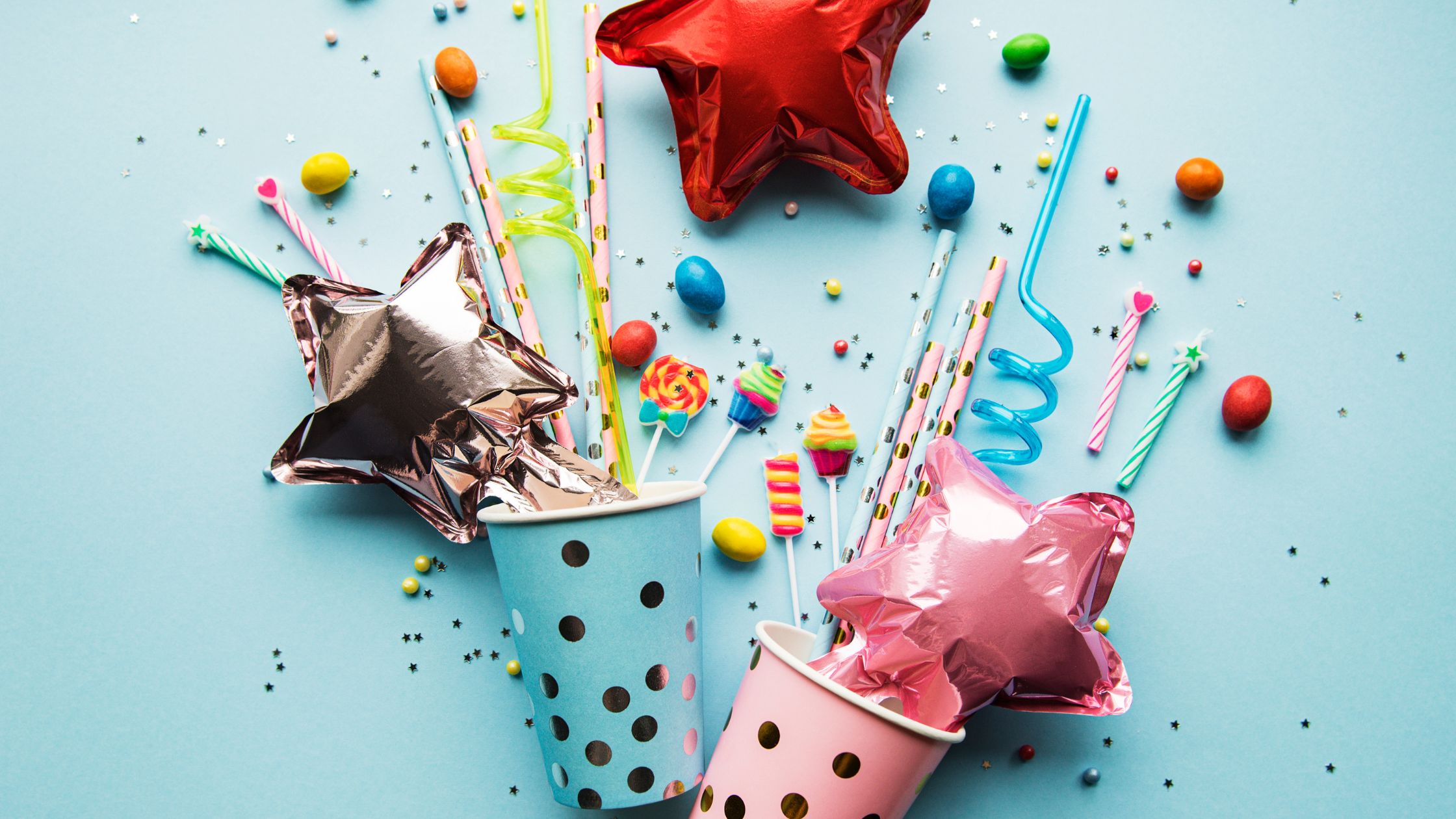
The shades defining the all-pink monochrome party in 2026 exist on a spectrum. Hot pink — the descendant of Barbiecore — remains the loudest and most photographically striking option. It works for milestone birthdays, bachelorette setups, and any event where the goal is a bold, dramatic visual statement. Blush and dusty rose occupy the middle ground: feminine, soft, and appropriate for a broader range of events including baby showers, bridal showers, and garden parties. The coquette aesthetic has turbocharged demand in this range specifically, with bow-motif decorations, pearl garlands, and velvet textures all operating in the blush and dusty rose spectrum. Rebel Pink — IKEA’s named shade — sits between blush and hot, a punchy, slightly lavender-tinted pink that energises a space without the intensity of neon.
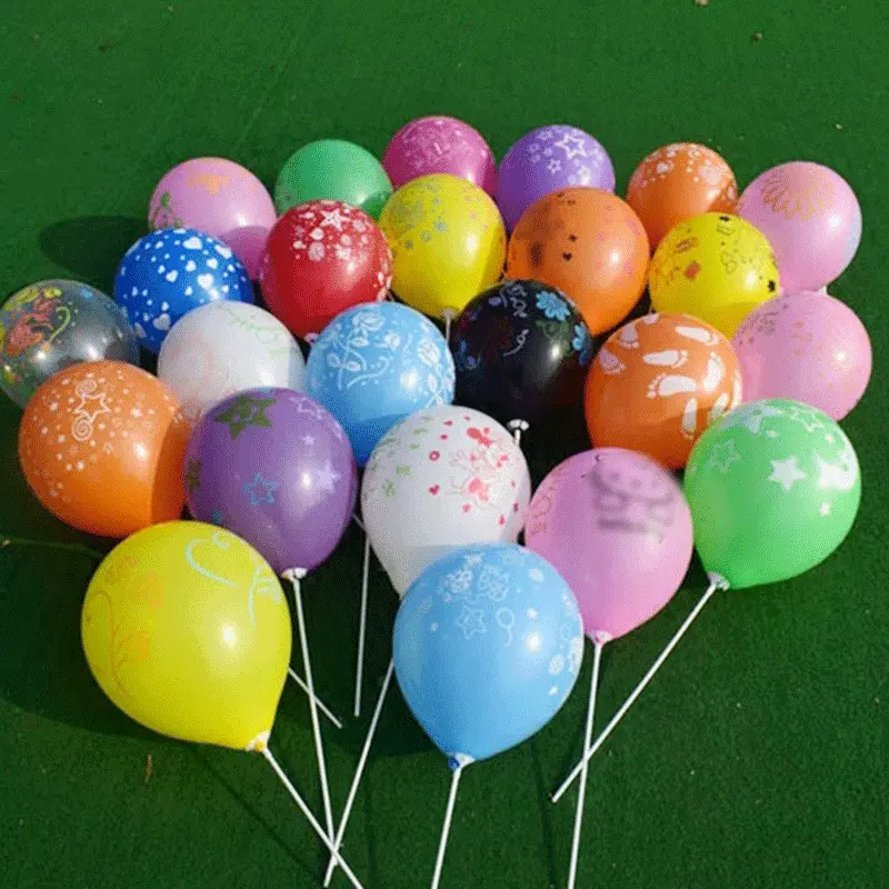
What unifies all of these shades under the monochrome principle is the commitment. If you are going pink, everything is pink. Pink cups. Pink flowers. Pink cake. Pink tablecloth. Pink plates. Pink balloon arch. Pink napkins. This is the principle articulated by party trend analysts and endorsed by the most-shared setups on TikTok and Pinterest. The monochrome effect only reads as intentional when it is complete.
The practical execution of an all-pink setup is easier than most people assume because the pink party supply category is the most developed colour range in the wholesale party market. Every supplier — from specialist party wholesalers to general event supply distributors — carries balloons, tableware, banners, garlands, backdrops, and favour accessories in pink across multiple shade points. The colour consistency challenge that makes some monochrome setups difficult — where a sage from one supplier does not match a sage from another — is less severe in pink because the category is so well-established and product development has been driven by consistent demand for years.
For retailers and event planners building a monochrome pink category, the shade strategy is the most important buying decision. Stocking hot pink, blush, and a mid-tone like coral or rose allows a buyer to serve three distinct customer types — the bold, the soft, and the balanced — from a single colour family without requiring entirely separate product lines. The wholesale party decorations range that covers all three pink shade points from a single manufacturer eliminates the colour-matching problem that arises when different suppliers interpret the same colour name differently.
Also read – Bachelorette party supplies trends 2026
What Makes All-Green the Other Defining Monochrome Party Colour of 2026?
Green’s rise in the party setup context is distinctly different from pink’s — it arrives from a different cultural direction and serves a different emotional register, which is precisely why both colours are dominant simultaneously. They are not competing; they are serving different occasions and different customer personalities.
The green monochrome party draws from the intersection of three 2026 trends. Biophilic design — the design philosophy of bringing natural, living elements into built environments — has made green the colour most associated with contemporary sophistication and environmental consciousness. Meri Meri’s 2026 trend report specifically names saturated sea green among the dopamine-boosting hues rooms are being dressed in from floor to ceiling. The wildflower, botanical, and garden party aesthetics that have dominated baby showers and bridal celebrations since 2023 have naturalised green as a party colour in a way that it had not been before, transitioning it from Christmas-exclusive to year-round event staple.
The green monochrome palette splits into three distinct commercial expressions that require different product mixes.
Sage green is the softest and most widely used. It is the colour of linen, dried botanicals, eucalyptus, and the calm, nature-inspired aesthetic that has taken over everything from baby shower setups to corporate event styling. Sage green party supplies — tableware, table runners, balloon sets, and hanging decorations — have been among the fastest-growing colour segments in wholesale party supply buying since 2024. The sage-and-white combination is the most accessible entry point for monochromatic green styling: not fully committed to a single colour but strongly directional and very easy to execute at home with basic supplies.
Emerald green sits at the other end of the spectrum — jewel-toned, dramatic, and luxurious. An all-emerald setup reads as sophisticated and high-end. Hunter green satin tablecloths, sequined emerald backdrops, and dark green floral installations create the kind of event atmosphere associated with black-tie evenings, milestone birthdays, and styled corporate celebrations. The colour has deep psychological associations with opulence and success, which is part of why it works so effectively for milestone events that want to feel significant rather than just fun.
Bright and neon greens occupy the most energetic end of the spectrum, operating closer to the dopamine-maximalist philosophy. Lime green, grass green, and electric green create an immediate, almost physical reaction in a photographed space. They are the green equivalent of hot pink — bold, statement-making, and best suited to events where the goal is maximum visual impact.
Monochromatic green layering — mixing sage, mint, and emerald within the same setup — is one of the most sophisticated execution techniques for green-themed events. This technique works by maintaining the single-colour-family commitment while introducing the kind of tonal variation that gives a setup visual depth and prevents the flat, single-note effect that a poorly executed monochrome can produce. A sage tablecloth, eucalyptus centrepieces, emerald napkins, mint tableware, and a deep hunter green balloon arch at the backdrop creates a complete, layered scene that reads as richly considered rather than simply everything-in-one-colour.
Which Events Are Driving Monochrome Pink and Green Demand?
Understanding which occasions are generating the most monochrome party supply buying tells buyers and retailers exactly where to focus their stocking decisions.
All-pink setups are most commonly executed for four event types: milestone birthday parties (particularly 21sts, 30ths, and 40ths), bachelorette parties and hen dos, baby shower setups for girls, and bridal shower celebrations. The bachelorette market is particularly significant — the coquette and blush-pink aesthetic is one of the most searched bachelorette themes of 2026 and generates some of the highest spend-per-head of any consumer party category.
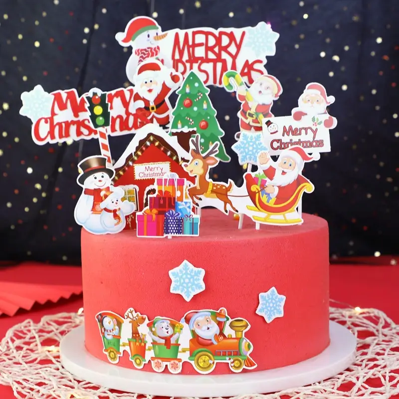
All-green setups dominate in a different event cluster: baby showers for gender-neutral or nature-themed celebrations, garden and outdoor birthday parties, bridal showers with a botanical or wildflower aesthetic, corporate events where green signals environmental commitment or brand alignment, and Christmas celebrations where green is repurposed from a seasonal-specific colour to a sophisticated full-event palette.
Both colours cross over into each other’s event types for a simple reason: the monochrome principle works regardless of the occasion. What changes is the shade selection. A hot pink 30th birthday setup and a sage green baby shower are both monochromatic; they just dial the shade and the specific product mix differently to match the occasion’s emotional register.
How to Execute a Monochrome Party Setup That Actually Looks Intentional
The difference between a monochrome party setup that looks professionally styled and one that looks like someone bought everything in the same colour without thinking about it comes down to four execution principles.
The first is shade discipline. Choose one specific shade within your chosen colour, not just the colour family. Hot pink and blush pink in the same setup break the monochrome effect. Sage green and neon lime green together do the same. The monochrome commitment is to a shade, not just to a hue. This means being specific when ordering: not “pink balloons” but “blush matte latex balloons,” not “green tablecloth” but “sage green linen-texture tablecloth.”
The second is texture variation. Because the colour is constant, the interest in a monochromatic setup must come from texture contrast. Matte latex balloons next to chrome foil balloons. Velvet table runners next to paper napkins. Dried botanical centrepieces next to glossy acrylic signage. The colour holds everything together; the textures make it visually interesting. This is the principle articulated in dopamine dressing guidance — combining vibrant colours with sensory fabrics to increase the psychological reward — and it translates directly to event decoration.
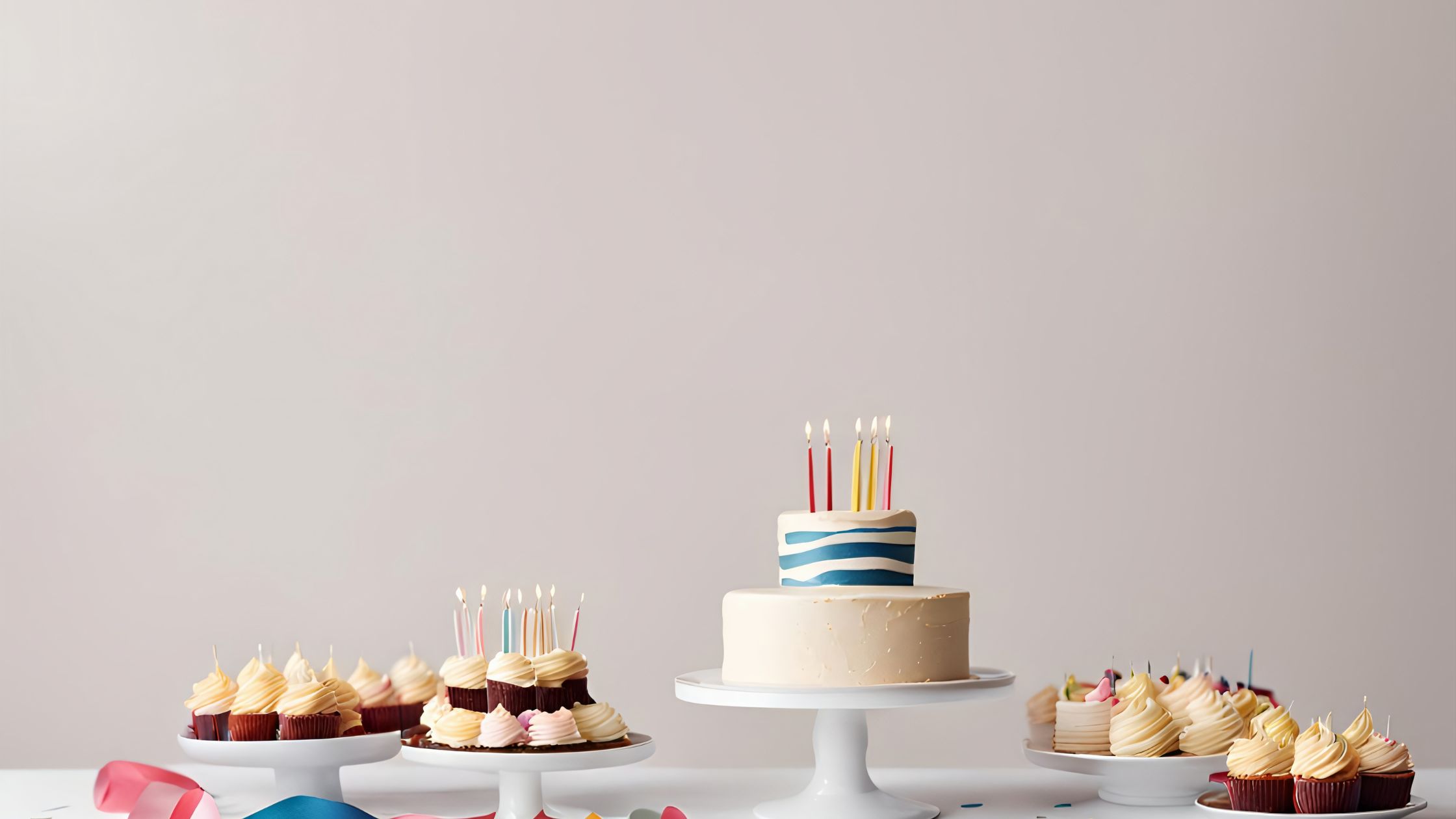
The third is height variation. A flat monochromatic table where everything sits at the same height reads as one-dimensional. Vary the height of centrepieces, use a tall balloon on a stick at the table edge, stack cake stands of different heights, and hang garlands at varying ceiling heights. The colour pulls the eye across the space; the height variation gives the eye somewhere interesting to travel.
The fourth is one deliberate neutral accent. A fully executed monochrome setup often benefits from one neutral element — not a competing colour, but a true neutral like cream, metallic gold, or clear acrylic — that acts as a visual rest point. A gold candle holder on an all-pink table, a cream linen napkin on an all-sage table, or a clear acrylic sign on an all-emerald backdrop all provide this function without breaking the monochrome commitment.
Also read – Import duties on party supplies
What Products Do You Actually Need for an All-Pink or All-Green Monochrome Setup?
Executing a complete monochromatic event setup requires covering seven product categories, all in the same shade or shade family.
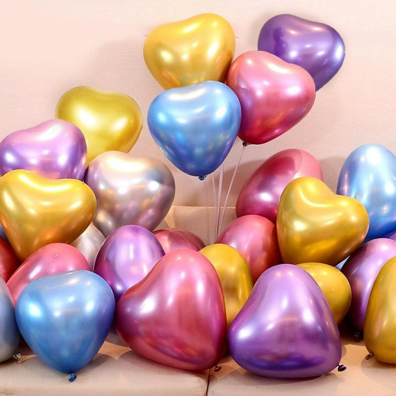
Balloons are the highest-visual-impact element. For a monochrome setup, you need balloons in at least two sizes (typically 11-inch and 16-inch for an arch or organic display) and at least two finishes (matte and chrome or metallic). The combination creates the textural variation that makes a balloon arch look professionally assembled rather than simply inflated. A single shade across all balloon sizes, with the only variation being matte versus chrome finish, is the most effective approach.
Tableware — plates, cups, napkins, and tablecloth — is the foundation of the table. For a truly monochrome effect, every tableware piece should operate within the same shade family. This is where buying from a single wholesale party supplies source matters most: a plate and a napkin from different suppliers in “blush pink” will rarely be the same blush.
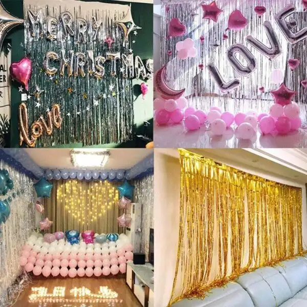
Backdrop and photo wall elements establish the main visual anchor. For an all-pink setup, sequin or fringe curtains in the shade, a balloon arch in the same palette, and any printed signage or neon element should all operate within the chosen shade. For all-green, sequined emerald backdrops, greenery walls or botanical installations, and fabric drapes in the shade create the most effective foundation.
Floral and botanical elements are the wild card. Fresh flowers are impossible to perfectly colour-match to a manufactured shade, but this is actually an advantage — the slight variation of fresh blooms within a colour family adds organic texture that avoids the artificially perfect look of an entirely manufactured setup. Pink peonies, blush roses, and soft pink carnations together create a richer all-pink floral composition than a single flower in a single manufactured shade. For green, eucalyptus, fern, pampas, and tropical leaf combinations create the same layered effect.
Banners and garlands define the space beyond the main backdrop. Tassel garlands, paper fan garlands, and letter banners in the theme shade are the simplest and most versatile elements for extending the monochrome into the full room.
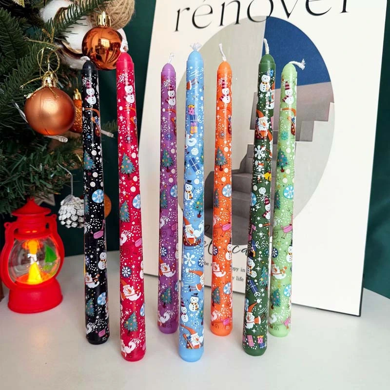
Candles and lighting give the setup warmth and depth. Matte candles in the shade colour within glass holders, or coloured glass holders that filter light in the theme hue, complete the table composition. For evening events, coloured lighting — specifically a wash in the theme colour — can extend the monochrome effect to the walls and ceiling.
Favours and personal accessories complete the experience for guests. In a monochrome setup, even the favours should commit to the colour — packaged in the shade, tied with ribbon in the shade, or selected as items that naturally exist in the colour family.
For retailers building a monochrome colour collection, buying across all seven product categories from a single source through a wholesale party decorations account ensures shade consistency across the full range. For event planners styling individual events, having a trusted manufacturer relationship that covers balloons, tableware, and backdrops in consistent colour specifications is the operational advantage that separates polished results from amateur ones. Hotels and venues building an in-house party supply capability benefit from stocking the full monochrome range — pink and green at minimum — through a wholesale party supplies for hotels account.
The Wholesale Opportunity in Monochrome Party Supplies
For buyers sourcing at wholesale, the monochrome trend creates a specific commercial opportunity: buyers no longer need a separate product range for each event type. A well-curated all-pink collection serves bachelorette parties, birthday celebrations, baby showers, and bridal showers from the same product pool. A well-curated all-green collection serves garden events, botanical-themed baby showers, gender-neutral celebrations, and sophisticated evening events from the same pool.
This concentration of event types around a single colour reduces inventory complexity while increasing sell-through rate the ideal wholesale buying dynamic. Rather than stocking 15 different themed collections, a retailer or event planner can stock three or four deep monochrome colour collections and serve the majority of the consumer demand they encounter.
The products that move fastest within a monochrome wholesale buy are consistently balloons (the highest volume, fastest to sell), tableware sets (the foundation of every event), and backdrop elements (the most photographed and most shared pieces that drive future demand organically through social media). Wholesale party supplies for retailers accounts that organise their buying around colour collections rather than occasion collections report better display coherence, higher average basket values, and faster inventory turnover.
For business owners building a party supply resale operation, the monochrome trend also simplifies the product curation challenge. A wholesale party supplies for resale buyer who commits to stocking three deep colour collections, pink in three shades, green in three shades, and a third high-demand colour, can serve the majority of 2026 consumer demand without the complexity of stocking 20 different occasion-specific themed ranges. The event and party supplies wholesale range at PartySparkz covers the full colour spectrum across all seven product categories identified above, with consistent shade specifications across product lines.
What Other Monochrome Party Colours Are Gaining Traction in 2026?
Pink and green are dominant, but the monochrome party format is driving demand across other colours as well, and buyers building monochrome collections should understand the full landscape.
All-yellow setups — in lemon, sunshine, and butter shades are the third most searched monochrome party palette for 2026, driven by the dopamine-maximalist energy of canary yellow and the broader honey and floral aesthetics trending in baby shower and bridal contexts.
All-black and all-white monochrome setups occupy a different register entirely, sophisticated, adult, and event-specific. The all-white setup (described by one 2026 trend report as “pure and pristine, where everything is white, clear, or sparkly”) dominates in minimalist bachelorette setups and gender-neutral baby showers. All-black operates in the high-drama birthday and Halloween-adjacent aesthetic space.
All-blue setups in particular are benefiting from the coastal and Mediterranean trend of 2026, driven by the Amalfi Coast-inspired palettes that have become one of the year’s most searched party aesthetics. Azure, cobalt, and navy in a monochromatic setup read as sophisticated, travel-adjacent, and distinctly different from the traditional blue of boys’ baby showers.
The commercial lesson for buyers is that the monochrome principle is the trend, not any individual colour. The first mover advantage belongs to buyers who build their range around a flexible monochromatic framework, strong depth in the highest-demand colours (pink and green), secondary coverage in the growing colours (yellow, white, blue), and a consistent commitment to shade coherence across all categories within each colour.
Frequently Asked Questions
Three forces converged simultaneously in 2025 and 2026. The dopamine decor movement established the principle that saturated, single-colour environments create stronger emotional responses and better photographs than multi-colour alternatives. IKEA naming Rebel Pink as its 2026 Colour of the Year validated bold pink at a mainstream cultural scale. And the sustained dominance of botanical and nature-inspired event aesthetics has elevated green across sage, emerald, and botanical green into year-round party colour territory. The monochrome format works as a visual system because it photographs better than any alternative, requires fewer decisions to execute well, and creates an immersive atmosphere that guests experience physically as well as visually.
Mixing shades within the same colour family is not only acceptable, but it is also what separates sophisticated monochromatic setups from flat, one-note ones. A sage tablecloth, mint tableware, emerald napkins, and a deep hunter green balloon arch together create a richer all-green setup than using a single shade of green throughout. The principle is colour family commitment, not single-shade uniformity. What breaks the monochrome effect is introducing a different colour cream, gold, or a completely different hue, as a major element rather than a very minor accent.
Balloons are the highest visual-impact element and the hardest to colour-match across different suppliers. Because the monochrome effect depends on shade consistency across the entire setup, getting the balloon shade right — and matching it to the tableware and backdrop shade — is the most critical execution decision. This is why sourcing balloons and tableware from the same wholesale manufacturer matters for monochrome events in a way that it does not for multi-colour themes.
All-pink setups are most commonly used for bachelorette parties and hen dos, milestone birthday parties, baby showers for girls, and bridal shower celebrations. All-green works most naturally for gender-neutral baby showers, garden and outdoor birthday parties, botanical and wildflower-themed bridal showers, and corporate events where green communicates brand or environmental alignment. Both colours are flexible enough to work across almost any event type when the shade is calibrated to the occasion’s emotional register — hot pink for high-energy celebrations, blush for softer occasions; sage for calm, natural events, emerald for glamorous or milestone ones.
Texture variation is the answer. Because the colour is constant, visual interest must come from contrast in texture and material — matte latex balloons next to chrome foil, velvet table runners next to paper napkins, dried botanical centrepieces next to glossy acrylic signage. Height variation also prevents flatness — vary the heights of centrepieces, use different-sized balloons in an arch, and layer tableware at different elevations using cake stands and risers. One very small neutral accent — a gold candle holder, a cream ribbon — gives the eye a momentary rest point that actually makes the dominant colour appear more vivid in contrast.